01
The platform
MTMPath is a Medication Therapy Management platform — a clinical tool pharmacists use every day to manage patient care.
When I arrived at Clarest, the platform was the product of years of feature work by rotating external design teams, none of whom were thinking about the big picture. The result was a UI that looked different on every screen. Hundreds of colors. Competing patterns. Accessibility gaps. The platform was also mid-migration from AngularJS to Vue, so the codebase was as fragmented as the interface.
For the clinical pharmacists using the platform every day, this meant friction. Time lost navigating inconsistency. Difficult onboarding for new internal and external users. An interface that got in the way of patient care instead of supporting it.
02
The audit
The first thing I did was audit the entire application — every screen, every component, every recurring pattern — to understand not just what existed, but what should exist.
So I counted.
-
27
Button styles
unique variants
-
26
Heading styles
unique variants
-
18
Form styles
unique variants
-
10
Body text styles
unique variants
-
9
Read-only styles
unique variants
-
5
Icon font libraries
differing weights & fills
-
4
Data table styles
unique variants
-
none
Pill system
mixed radii & colors
Twenty-seven ways to say this is a button. Twenty-six ways to say this is a heading. None of it was any one person's doing — it is what happens when a platform is built by teams who hand off and leave. But the count made the argument for me. I did not have to convince anyone the platform needed a system. I could show them.
03
Principles first
Before a color, before a token, before a single component: four principles, written down and agreed on with engineering and product. They are the part of the system that survives every later argument, because every later argument resolves against them instead of against taste.
-
01
Be Lean & Consistent
Avoid complicating solutions. Too many features or clutter overwhelms users. The goal is better display of critical information, not more information.
-
02
Prioritize Accessibility
Making accessibility a priority fosters forethought and intention, producing solutions that are leaner, more consistent, and lower friction. Incorporating accessibility early makes the product available to the widest possible range of users and devices.
-
03
Watch Users, Reduce Friction
Reduce friction by observing what users actually do to complete tasks. Learn the functionality they reach for most and bring it to the forefront in lean, consistent, and accessible ways.
-
04
Minimize Surprise
Users should not be surprised by how something behaves, and they should not have to guess whether an action was received. Elements relevant to the current context should be displayed — not hidden behind an action that reveals them.
04
The foundation
The foundation expresses the design language as code — color, type, and spacing, all distributed as CSS custom-property tokens. Not a swatch file handed to engineering. The values engineering actually builds with.
Color
Color in Promenade is organized into seven families — brand, primary, four utility, and neutral. Utility and neutral are built on an eleven-step ladder for maximum flexibility and so that contrast and accessibility can be reasoned about systematically.
Brand
- #4984C3
- #2D486B
Primary
- #F8F8F9
- #131C22
Utility — Info
- #E5EEF5
- #CADEEC
- #B0CDE2
- #86B3D2
- #5C98C2
- #327EB3
- #0863A3
- #075287
- #05416C
- #043150
- #032034
Utility — Success
- #E7EEE8
- #CFDCD1
- #B7CBBA
- #91B095
- #6B9470
- #44794B
- #1E5D26
- #194D20
- #143D19
- #0F2E13
- #0A1E0C
Utility — Warning
- #FFF5E7
- #FFEACE
- #FFE0B6
- #FFCF8F
- #FFBE68
- #FFAE41
- #FF9D1A
- #D48216
- #A86811
- #7D4D0D
- #523208
Utility — Danger
- #F5E7E7
- #ECCFCF
- #E2B7B7
- #D29191
- #C26B6B
- #B34545
- #A31F1F
- #871A1A
- #6C1414
- #500F0F
- #340A0A
Neutral
- #F0F0F1
- #E7E7E9
- #DFDFE1
- #C6C6C9
- #ADAEB2
- #95979C
- #7D8086
- #666A70
- #50555B
- #3B4147
- #262E34
Typography
Two families carry the entire platform. Alexandria sets every heading at 400 weight with a 1.2 line-height — tight, confident, easy to scan. Source Sans 3 handles every body block at 400/700 with a 1.4 line-height for lead blocks and 1.6 for the rest — quiet, readable, designed for the long clinical workday.
-
Heading 1
Alexandria 3.052rem 400 1.2
-
Heading 2
Alexandria 2.441rem 400 1.2
-
Heading 3
Alexandria 1.953rem 400 1.2
-
Heading 4
Alexandria 1.563rem 500 1.2
-
Heading 5
Alexandria 1.25rem 500 1.2
-
Lead
Source Sans 3 1.25rem 400 1.4
-
Body
Source Sans 3 1rem 400 1.6
-
Body strong
Source Sans 3 1rem 700 1.6
-
Small
Source Sans 3 0.8rem 400 1.6
Spacing & grid
Every gap and every column is a named token. Nine spacing steps — xxxs through xxxl — carry the rhythm. A grid of named percentages plus fractional divisions like 3rd and 6th carries horizontal layout, composing into rows without arithmetic. Engineers pick names, not pixels or percentages. That is how the interface stays consistent screen to screen, feature to feature.
- xxxs 0.25rem
- xxs 0.5rem
- xs 0.75rem
- sm 1rem
- md 1.5rem
- lg 2rem
- xl 3rem
- xxl 4rem
- xxxl 6rem
05
The component library
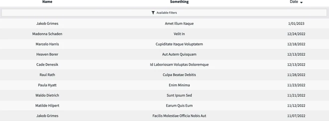
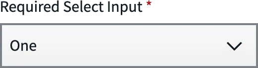
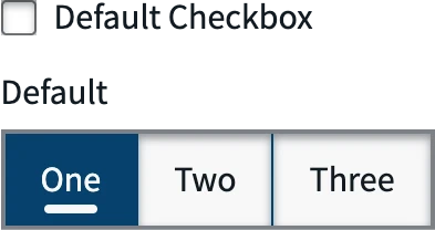
The system ships an independent, consumable component library — Vue 3 and TypeScript, adopted incrementally by the engineering team as screens moved from AngularJS to Vue. Two groups: sixteen core components for layout and display, eight form components for every input the platform uses. Each one carries a typed prop contract, so the constraints of the design system are enforced by the compiler rather than by a review comment.
That is the part that made it stick. A system engineers have to remember to follow is a suggestion. A system that fails the build is a system.
Core
-
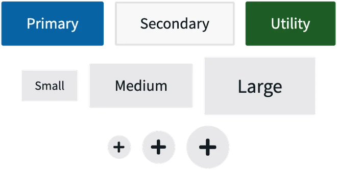
Button -

Heading -

Breadcrumbs -
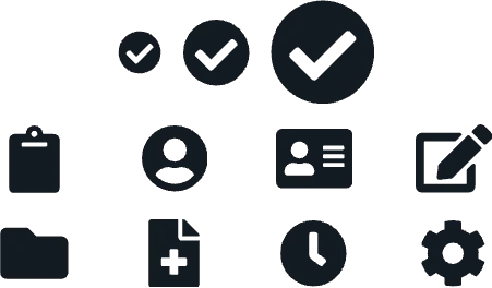
Icons -

Loader Bar -
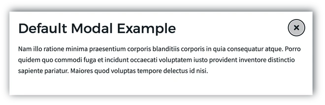
Modal -
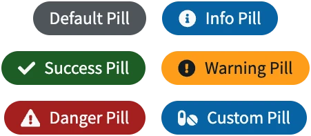
Pill -

Read Only -

Status Panel -
Table
Form
-

Text -
Select -

Textarea -
Checkbox / Radio -

File
06
Naming it, and writing it down
The engineering team and I named the system Promenade, a reference to the path found by the medication pathfinder (MTMPath). Naming it together mattered more than the name did. It stopped being the design team's system the moment engineering had a hand in what it was called.
Promenade ships three coordinated pieces. A foundation that expresses the design language as code. A Vue 3 and TypeScript component library that expresses the interface as parts. And an internally published documentation site that expresses the whole system as a shared reference — one place designers, engineers, and product can point to and agree on.
It became the single source of truth for design and engineering across MTMPath and Clarest's related products.
07
What it added up to
With Promenade in place, I partnered with product and internal users to redesign several high-volume core workflows — the screens pharmacists spend the most time in every day.
>50% reduction in time on key tasks, measured by Clarest leadership
Mike partnered with engineering, product and our internal users to redesign several high-volume core workflows. His work streamlined the experience to the point where we measured a greater than 50% reduction in time spent on key tasks without sacrificing effectiveness.
By the time of my exit, the platform had finished its migration to Vue and was running end-to-end on Promenade. Onboarding was smoother. The interface spoke one language.