01
The review
A Comprehensive Medication Review is a one-on-one consultation between a pharmacist and a patient — a core Medicare Part D benefit, and the reason MTMPath exists.
Over twenty to thirty minutes, on the phone, the pharmacist walks the patient through everything they take: prescriptions, over-the-counter medicines, vitamins. The review looks for interactions, duplicate therapy, side effects, and lower-cost alternatives. It ends with two documents — a Medication Action Plan the patient can follow, and a Personal Medication List recording everything they take.
Inside MTMPath, that consultation is a form. Depending on the type of review and the client's program, it runs to twenty or thirty sections. Some ask three questions. The complex ones ask ten or twelve. Others are data grids the pharmacist reads while talking, editing and adding records as the conversation turns them up.
It is the single largest consumer of time in the application — which makes it the place where a minute returned is worth the most.
-
20–30
Sections per review
varies by review type & client program
-
3–12
Questions per section
the complex ones sit at the top of that range
-
20–30
Minutes on the call
one-on-one, phone or in person
-
most
Of all time in MTMPath
which is why it was rebuilt first
02
What I inherited
Like the rest of the platform, the review had been built in passes by rotating external teams. The inconsistencies were functional as well as visual: controls that looked different doing the same job, patterns that behaved differently from one section to the next.
For a new pharmacist that made the workflow harder to learn. For an experienced one it never entirely went away — the interface kept asking for a small piece of attention that belonged somewhere else.
That is the cost, and it is an easy one to under-count. The pharmacist is on the phone with a patient. Every inconsistency spends a little of the attention that patient is supposed to be getting.
03
How I worked
I sat in on patient calls. Not a lab and not a moderated session — the actual call, watching a pharmacist work through the sections I was focused on, then following up afterward with the things I had seen and could not explain.
-
01
Ask first
Pharmacists weighed in on an idea while it was still an idea, not after it had been designed.
-
02
Demo
Engineering walked users through the change before it reached staging.
-
03
Staging review
Pharmacists worked the change themselves and said what was wrong with it.
-
04
Ship
The change went out to the people whose day it altered.
-
05
Sit in
I joined patient calls again — often to watch the change that had just shipped do its job, or fail to.
…and back to the top, with what the last change taught us.
The loop is the point. A workflow this long has no moment where you get to call it finished, so the useful question was never whether a change was right — it was whether the change beat what it replaced, and what it cost somewhere else.
04
The system first
Promenade landed here before it landed anywhere else. The highest-priority target for the design system was the workflow carrying the most time, so the medication review views were the first thing rebuilt on it.
That alone produced a reduction in the time a review took. No question had moved yet. No section had merged. The screens had simply stopped disagreeing with each other.
It is the cleanest argument for a design system I have. Consistency is not a finish applied at the end. It is a performance characteristic.
05
Then the structure
With the interface consistent, the structure underneath it was worth questioning. Did all of these sections make sense as sections? Were there questions sitting in the wrong one? Were there two sections that should be one?
The answers arrived in pieces.
-
Merged
Sections that were asking for one thing in two places became one section.
-
Moved
Questions relocated to the section where the pharmacist actually needed the answer.
-
Reworded
Questions rewritten so the pharmacist was not translating them out loud while the patient waited.
There was no single change that produced the result, and I would be suspicious of a case study that claimed there was. A workflow with thirty sections in it does not have one bottleneck. It has a hundred small ones, and the only way through is to keep finding them.
06
Before the call
The same work continued next door, in the Patient Chart — the part of the application holding the data grids and reports about the patient.
Its Medication grid is the complex one: the record of everything the patient is prescribed and where each prescription currently stands. Pharmacists lean on it to get current before a consultation starts, so the optimizations there were aimed at one thing — letting a pharmacist arrive at the call already knowing what they were looking at.
The consultation is where the time shows up. Some of it is spent before the consultation begins.
07
The other half: administration
All of it depends on the data underneath — the drugs, brands, and codes the review reads from. Administrators maintain that data, in a part of the platform that had been organized by accretion rather than by decision.
I mapped it by hand first.
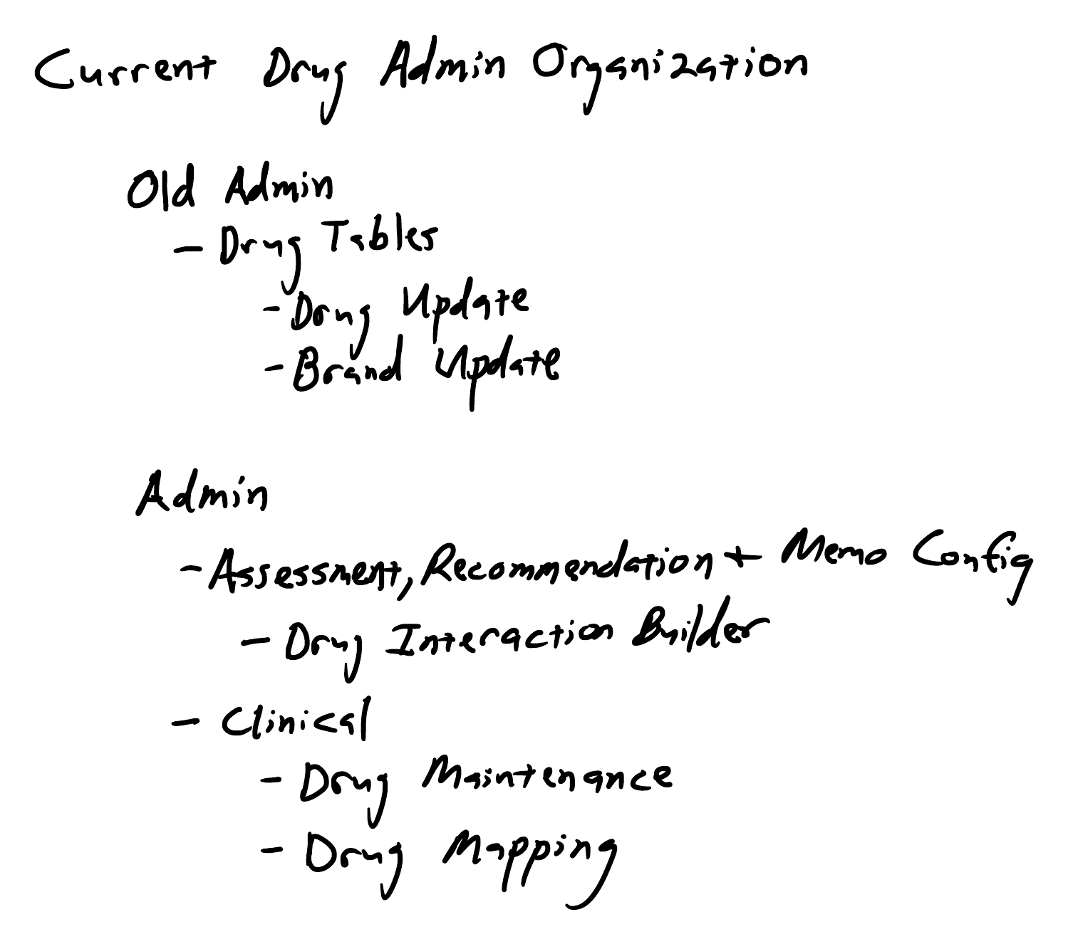
Before
- Old Admin
- Drug Tables
- Drug Update
- Brand Update
- Drug Tables
- Admin
- Assessment, Recommendation & Memo Config
- Drug Interaction Builder
- Clinical
- Drug Maintenance
- Drug Mapping
- Assessment, Recommendation & Memo Config
After
- Clinical
- Drug Maintenance
- Drug Mapping
- Drug Manager
- Brands
- NDCs
- Drugs
- Categories
- Forms
- Strengths
- Routes
Drug administration was split across two separate admin areas. A legacy admin app (here labelled Old Admin) held Drug Tables, with Drug Update and Brand Update beneath it. The MTMPath Admin page held the Assessment, Recommendation and Memo Config group leading to the Drug Interaction Builder, and a Clinical group holding Drug Maintenance and Drug Mapping.
Related work sat in unrelated places, and nothing about the arrangement told an administrator which was which.
08
Three options, one shipped
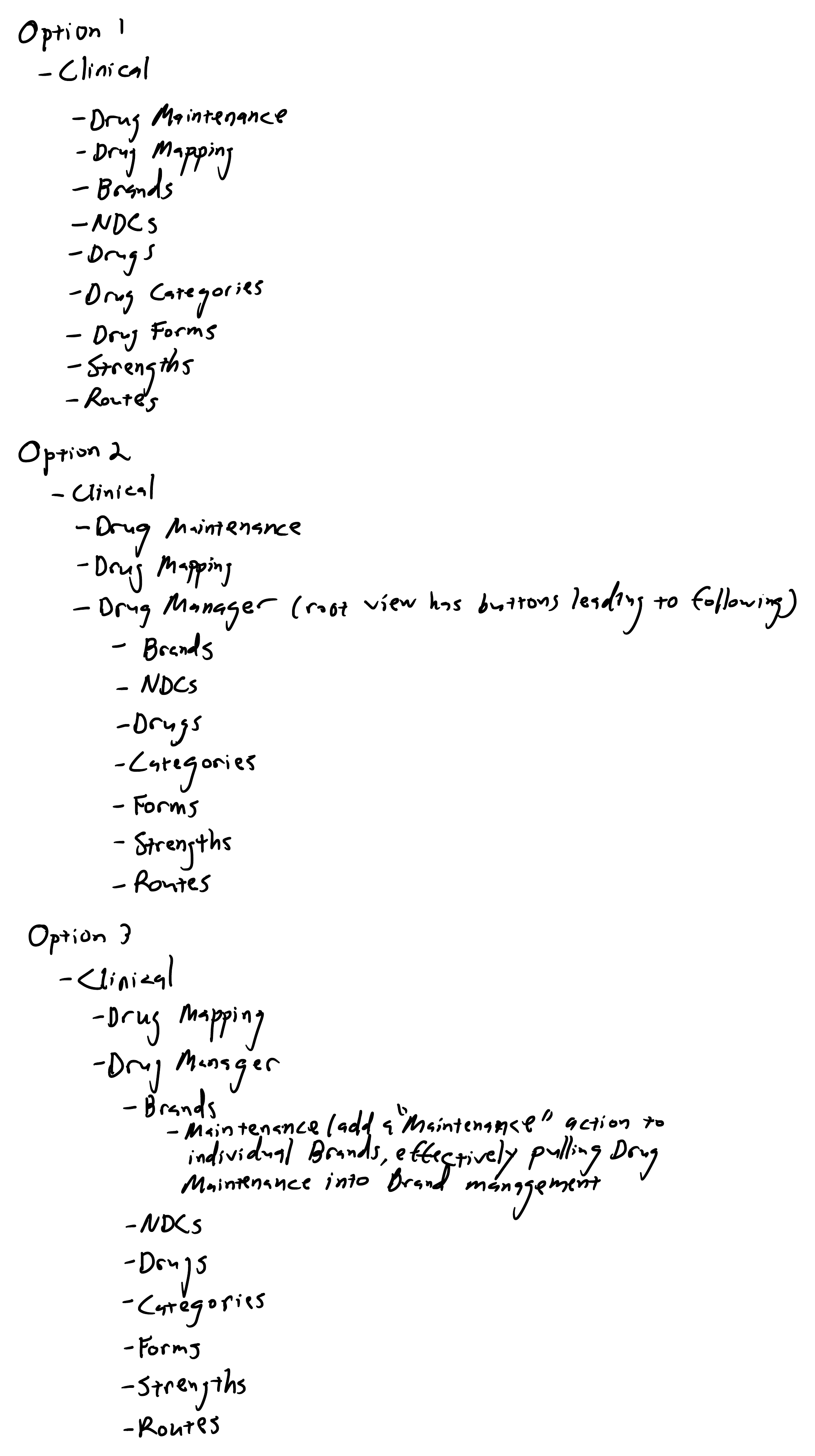
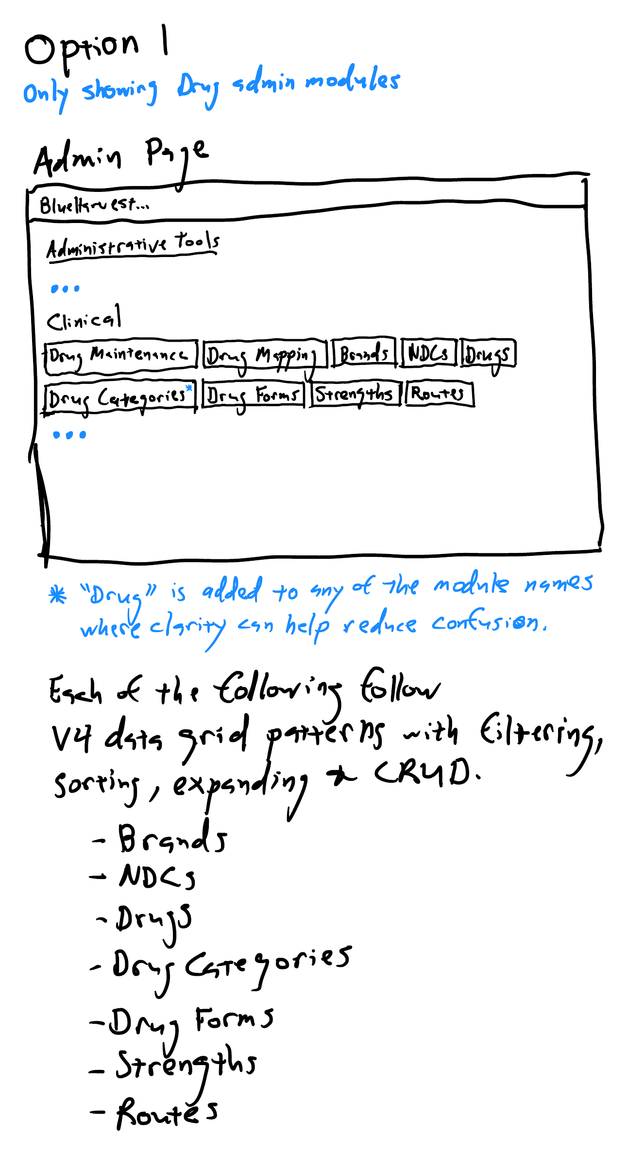
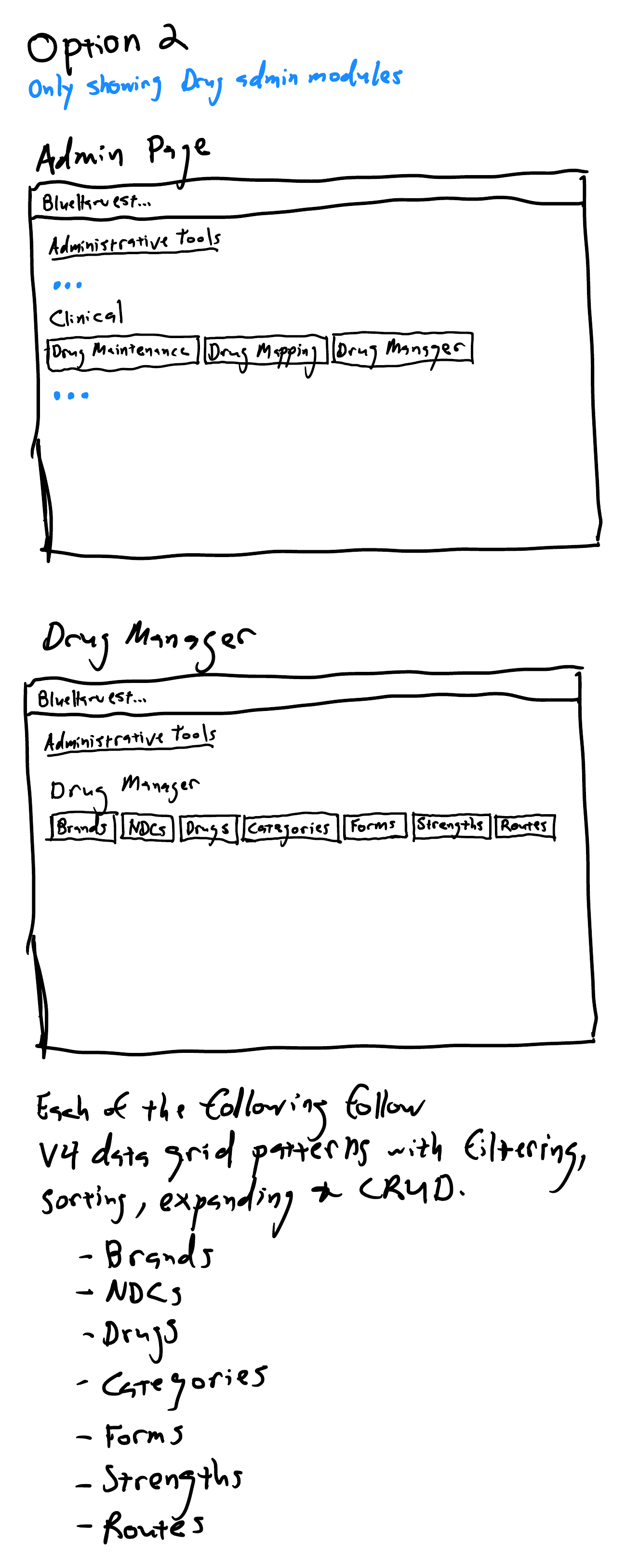
I sketched three ways to consolidate it. All three pull the seven drug modules — Brands, NDCs, Drugs, Categories, Forms, Strengths, Routes — into one place and standardize every one of them on the same V4 data-grid pattern: filtering, sorting, expanding, full CRUD. What they disagree about is how much hierarchy to keep.
-
Option 1
Flatten everything
Every module directly under Clinical, with “Drug” prefixed to names where it removed ambiguity. Simplest to build, and the noisiest to use. An administrator who is not managing drugs still has to read nine drug modules to establish that none of them are relevant — a cost paid on every visit, by everyone.
-
Option 2 Shipped
The Drug Manager hub
The admin page carries three things; the hub's root view routes to the seven modules behind it. It says something the flat list cannot — which functions belong together, and which ones an administrator can safely ignore right now.
-
Option 3
The hub, plus one more merge
The same hub, with Drug Maintenance folded into Brands as a per-row action that loads the maintenance form for that brand — eliminating a standalone module altogether. The tidiest of the three on paper.
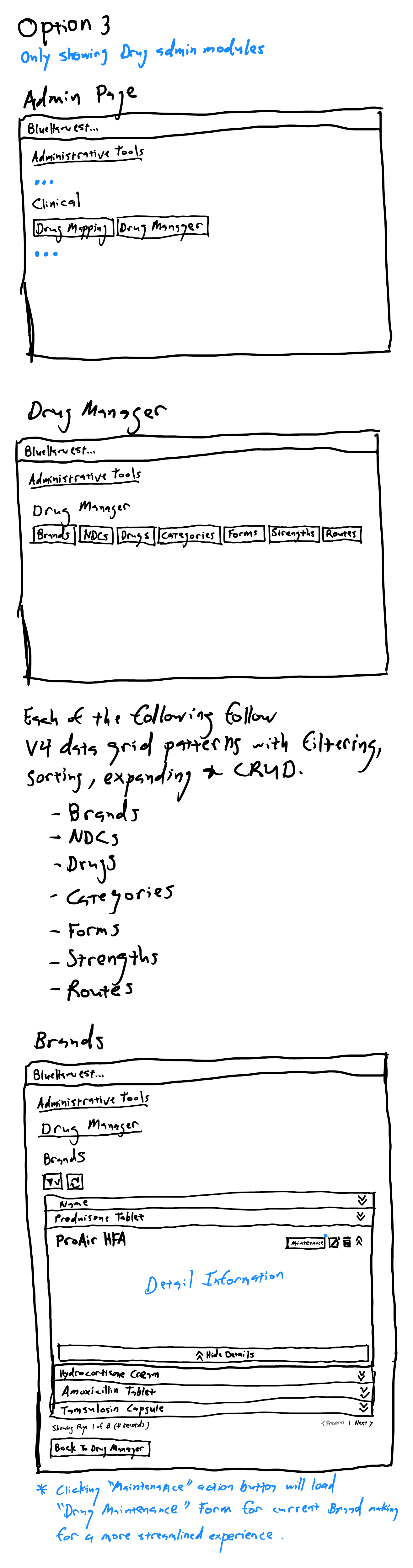
Option 2 shipped, and the choice between it and Option 3 was not mine to make on elegance. It came down to a question I could only answer by asking: did administrators think Drug Maintenance belonged inside brand management, or on its own? They did not think it belonged inside. So it stayed on its own.
Option 3 is the better diagram. Option 2 is the better match for how the people doing the work already group it — and Minimize Surprise is a principle, not a preference.
09
What it added up to
>50% reduction in time on key tasks, measured by Clarest leadership, without sacrificing effectiveness
That measurement covers this work as a whole — the medication review workflow, the Patient Chart optimizations feeding into it, and the administrative reorganization behind both. It is not one screen's number, and it would be dishonest to present it as one.
What it bought is easy to state and hard to earn. A pharmacist spends less of a consultation operating software, and more of it talking to the patient.